


Brand Style Guide
This brand identity for Changing Hands Bookstore centers on connection, community, and the shared experience of storytelling. The logo’s simple handshake motif symbolizes the exchange of ideas and the human connection found through books, while the warm, earthy color palette creates an inviting and grounded feel. Paired with clean, modern typography and hand-drawn illustrative elements, the system balances approachability with clarity, reflecting a bookstore that feels both thoughtfully curated and deeply personal.


Marketing Collateral
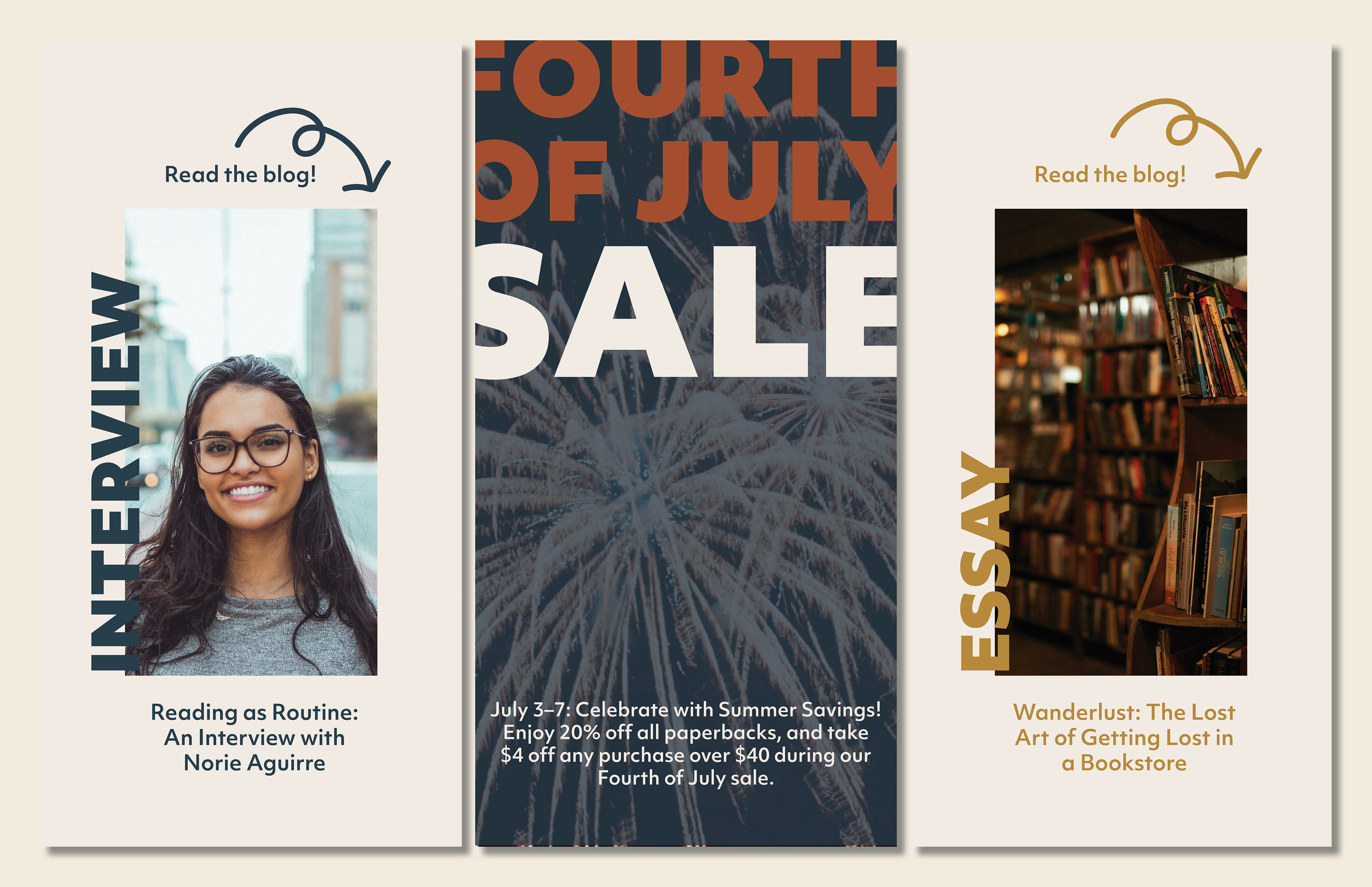
This marketing collateral for Changing Hands Bookstore extends the brand identity into a cohesive and engaging campaign across Instagram stories, email, and print. Each piece is designed to feel warm, inviting, and community-centered, using consistent color, typography, and illustration to create a recognizable visual language. The Instagram stories prioritize quick, eye-catching engagement, while the email layout balances readability with personality, and the poster serves as a bold, tactile touchpoint. Together, these materials work to promote events and drive connection, reinforcing the bookstore as a welcoming space for readers to gather, discover, and share stories.