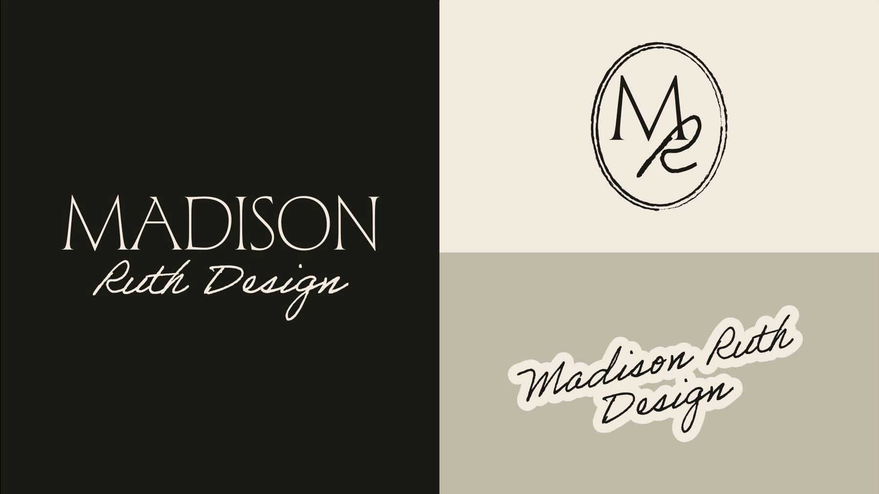
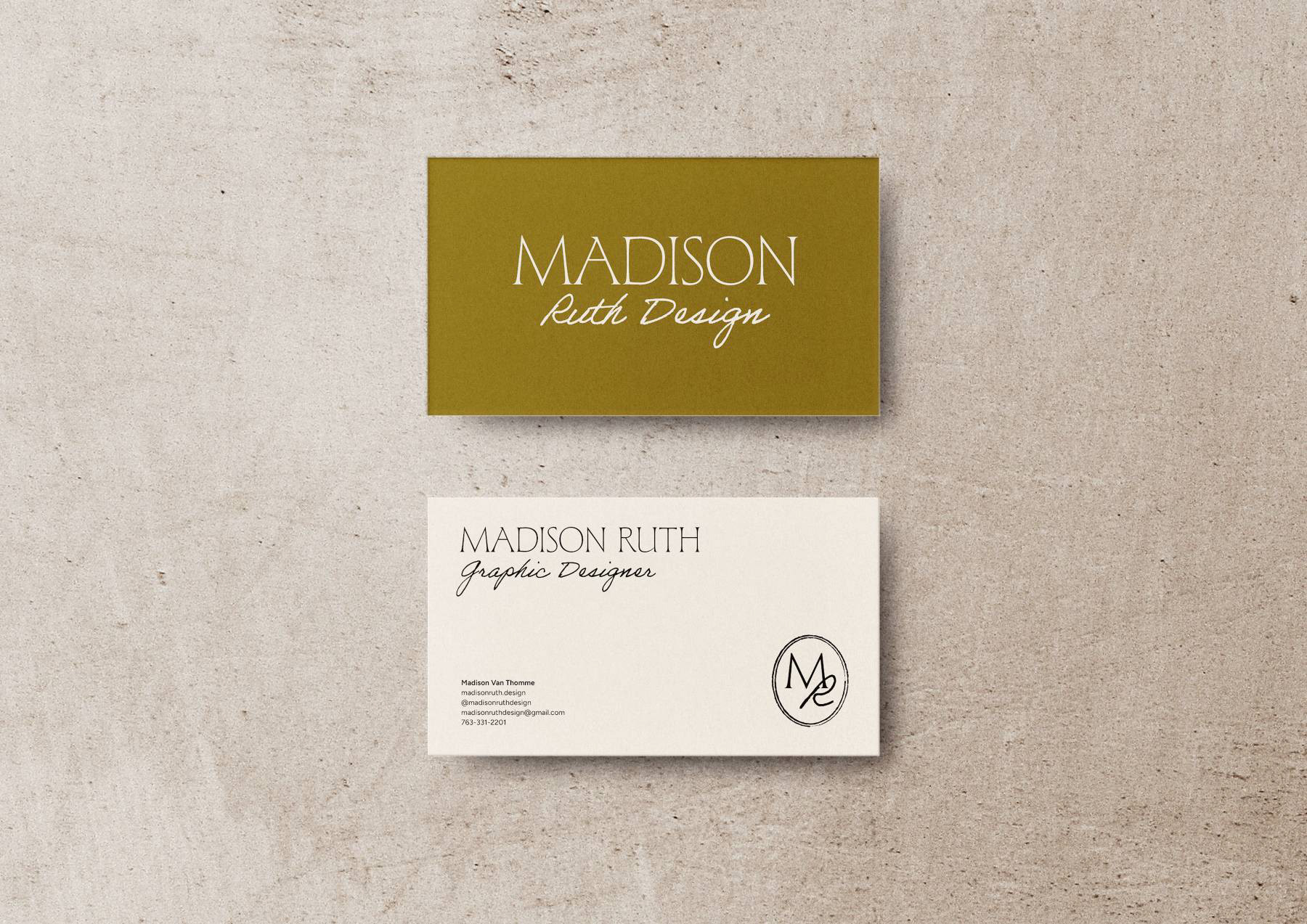
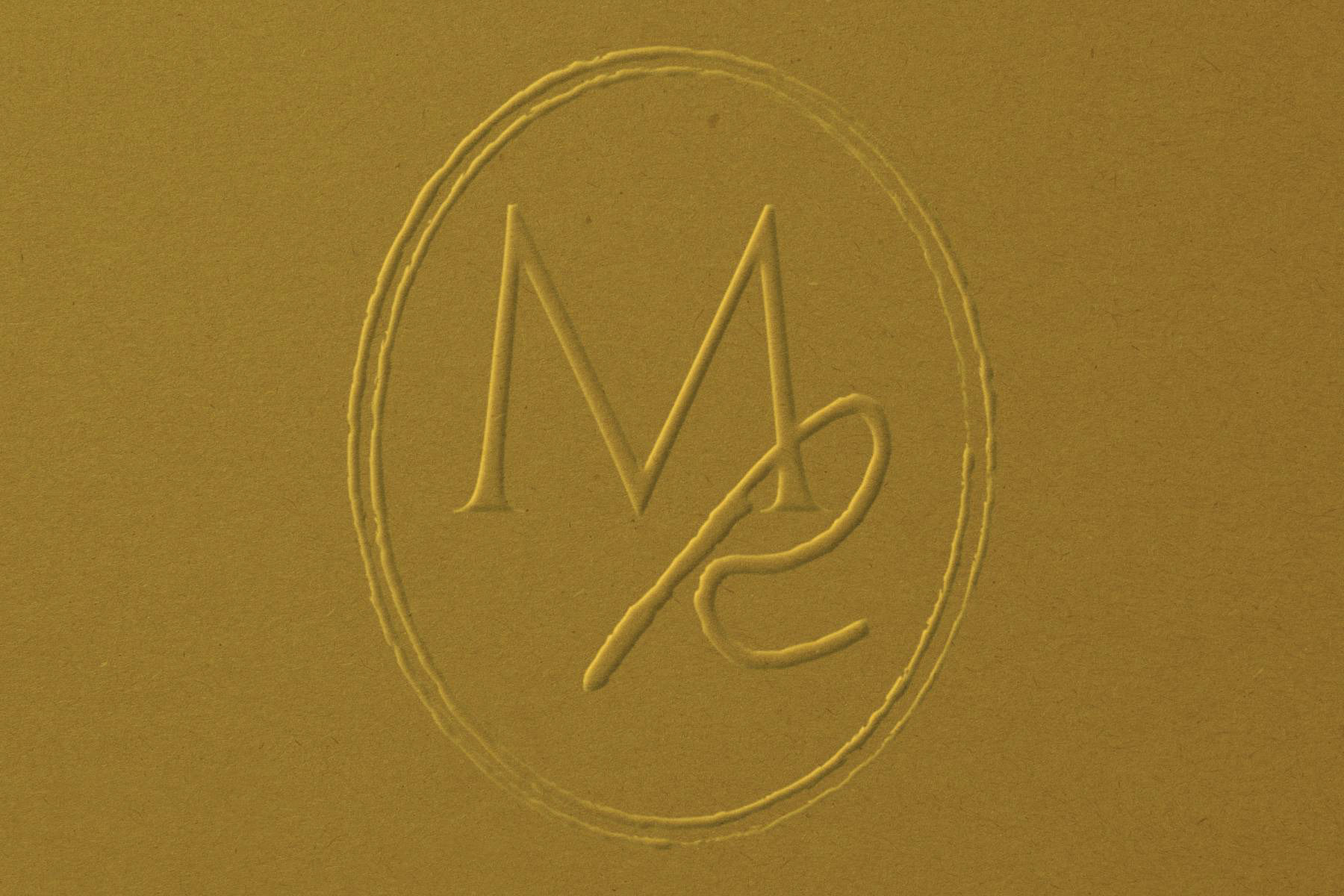
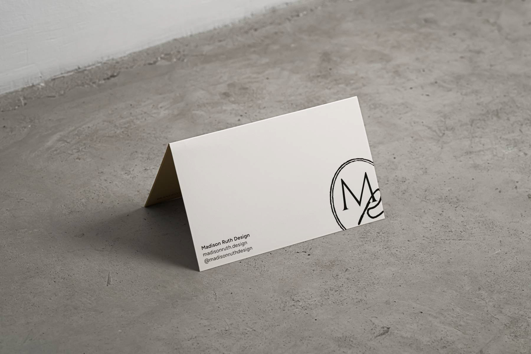
Logo Suite
When designing the logo, I wanted to strike a balance between elegant and playful. I chose two different typefaces to accomplish this. The top right logo is my logomark and social media logo, and the bottom right is my secondary logo. I wanted to give all three a warm, handwritten feel, which the script font and stamp feature of the social logo help create.
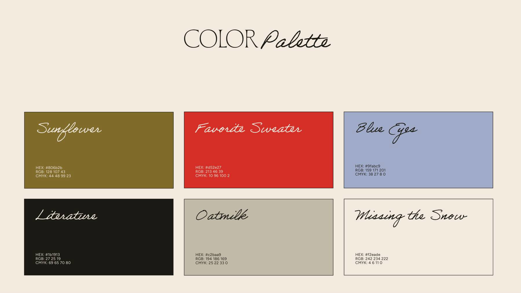
Color Palette
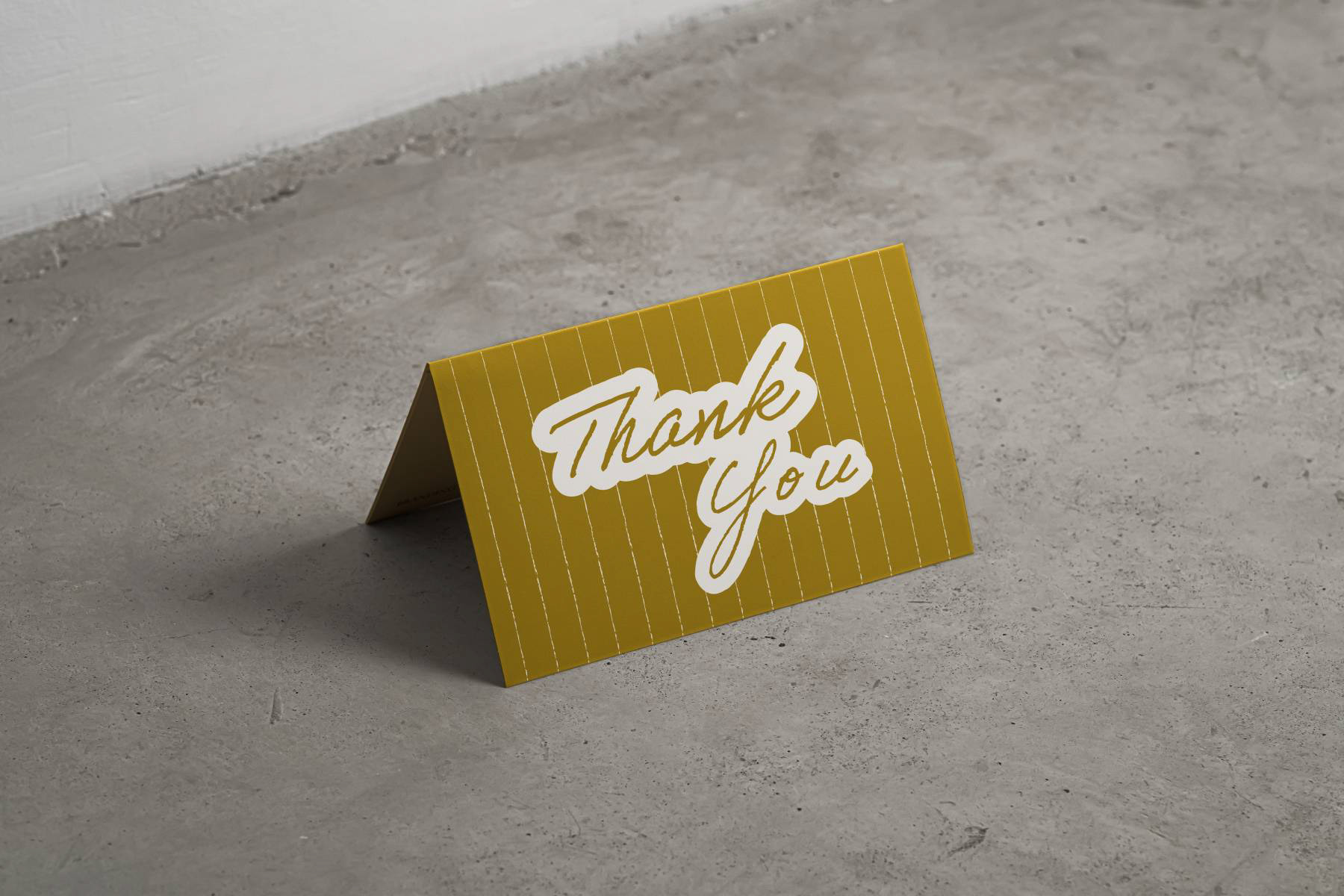
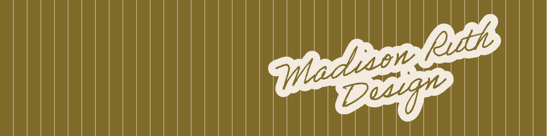
My color palette boasts of the basics: an inky black, tan, and cream. These colors feel timeless and classic, which represents me because I am a rule-follower. The mustard yellow stands for a sunflower, which embodies my name, Madison Ruth. Madison Ruth means "Brave" and "Companion", and sunflowers grow in community, bring others joy, and fearlessly reach towards the sun each day. The red and blue bring in pops of color and are used as accents in my designs.
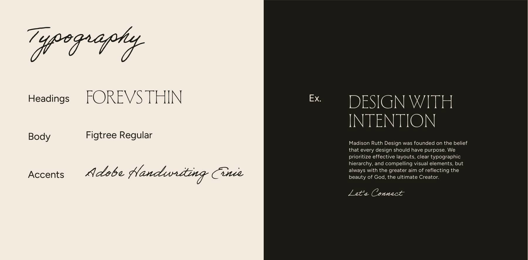
Typography
I chose Forevs Thin for my headings, which lends an elegant, stately look to my brand. Figtree Regular is used for body copy. It is clean while still being warm and welcoming. Finally, Adobe Handwriting Ernie is my script font. It gives the whole vibe a handwritten yet sophisticated feel.
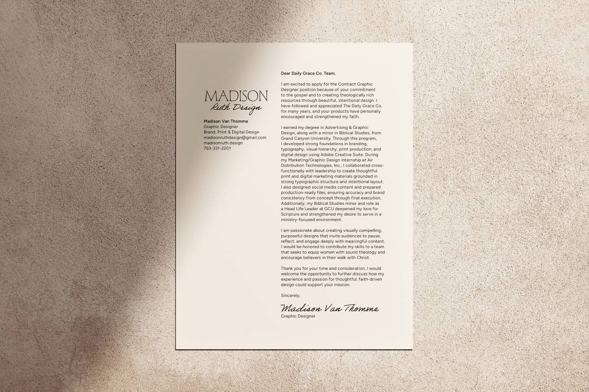
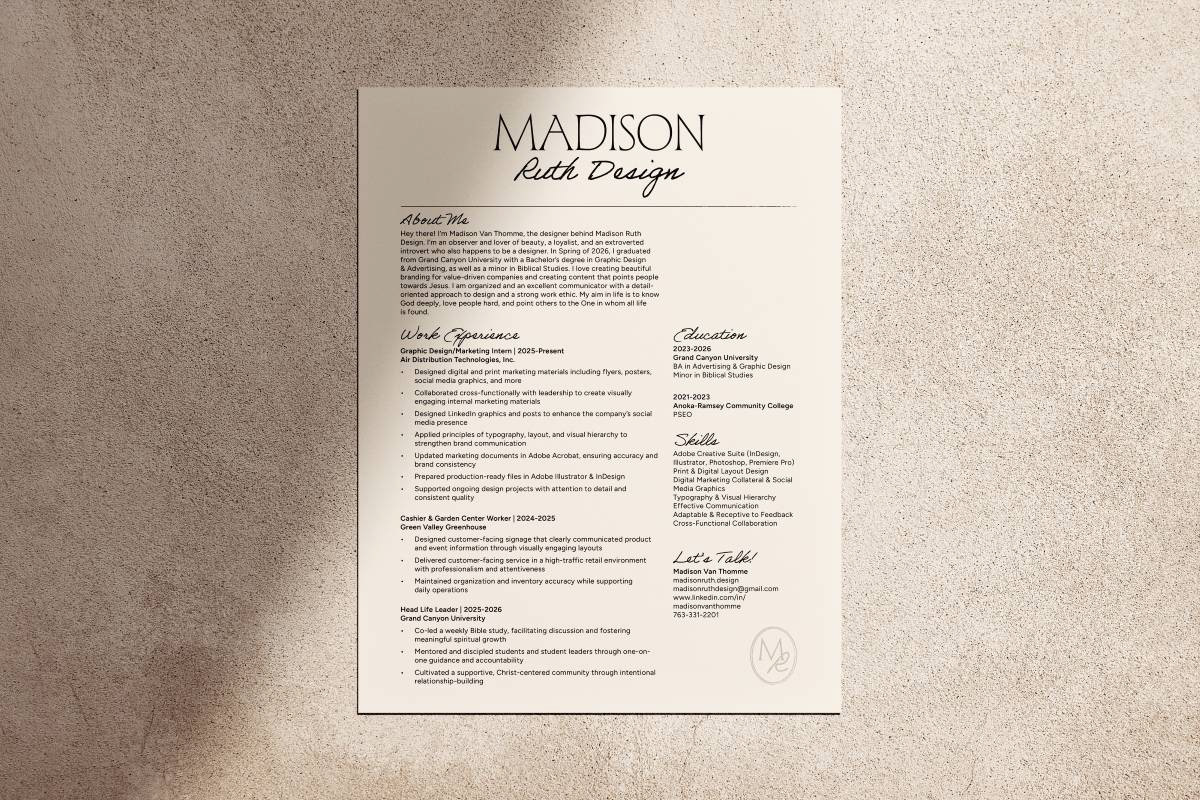
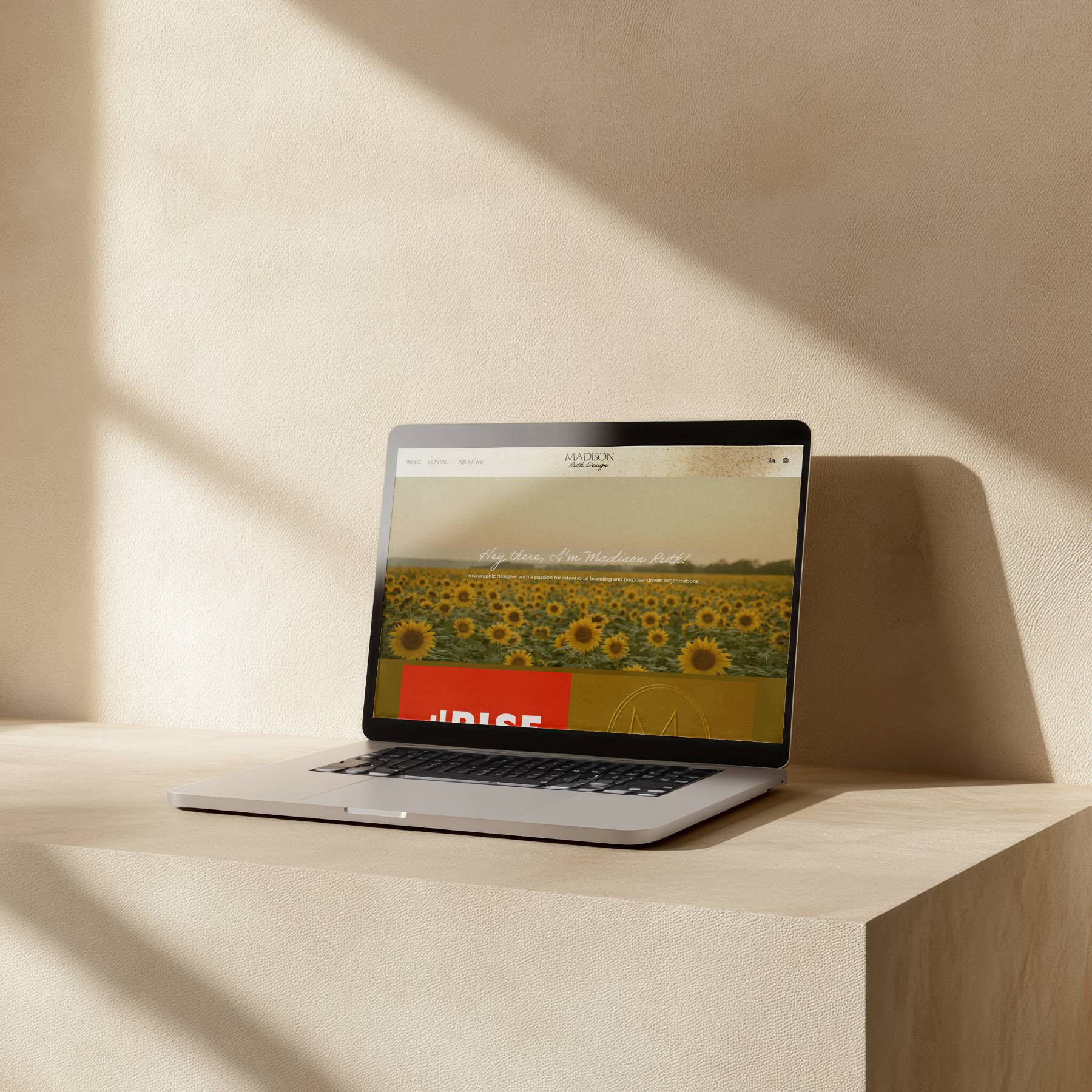
Brand Collateral
Above are my brand assets, including my social logo, resume, cover letter, business card, LinkedIn banner, and thank you card. I worked with my color palette of mustard yellow, cream, and black to maintain a cohesive and understated look. Across all pieces, I aimed to balance a sense of delicacy with professionalism, as well as lightheartedness with a more serious tone.