Brand Style Guide
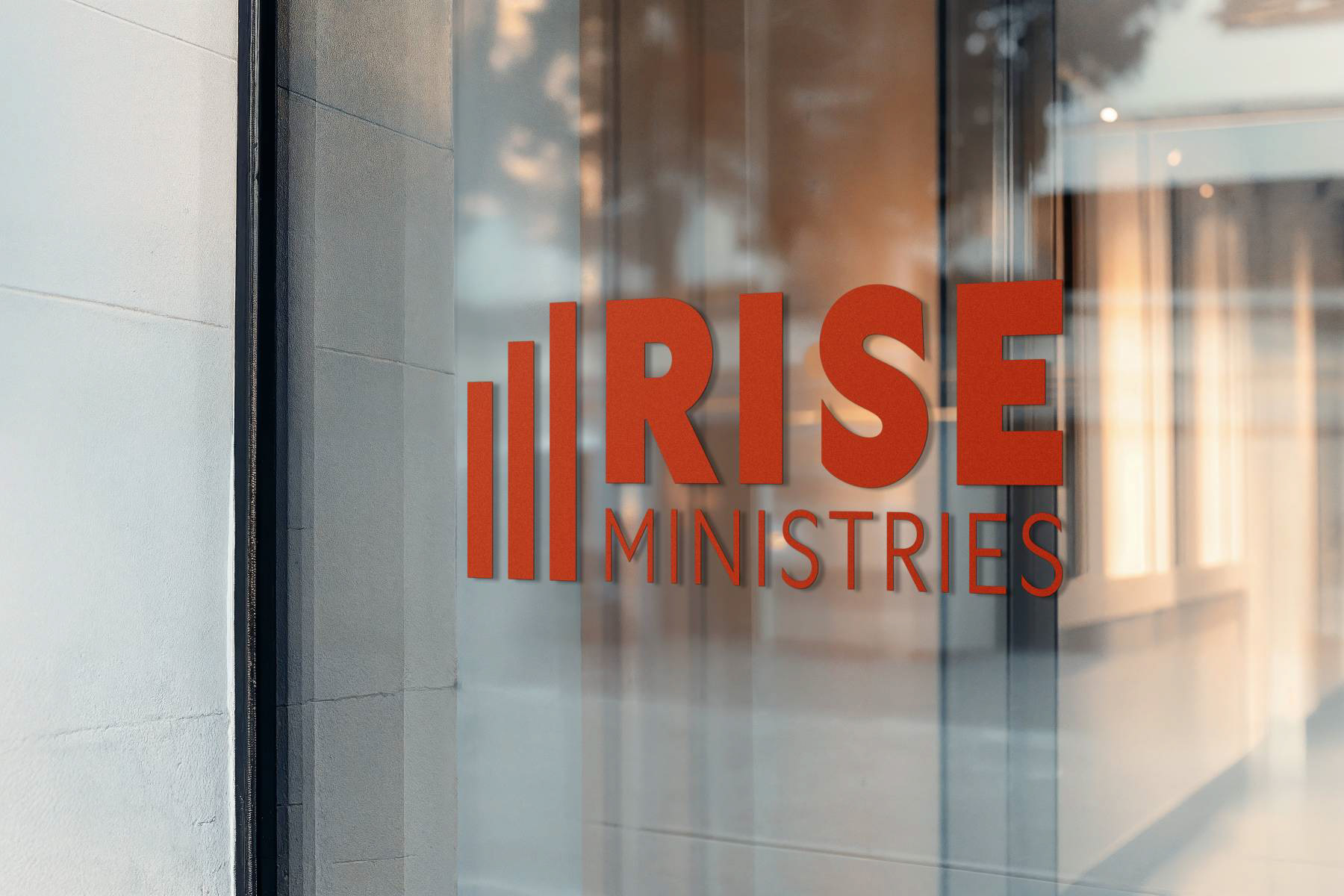
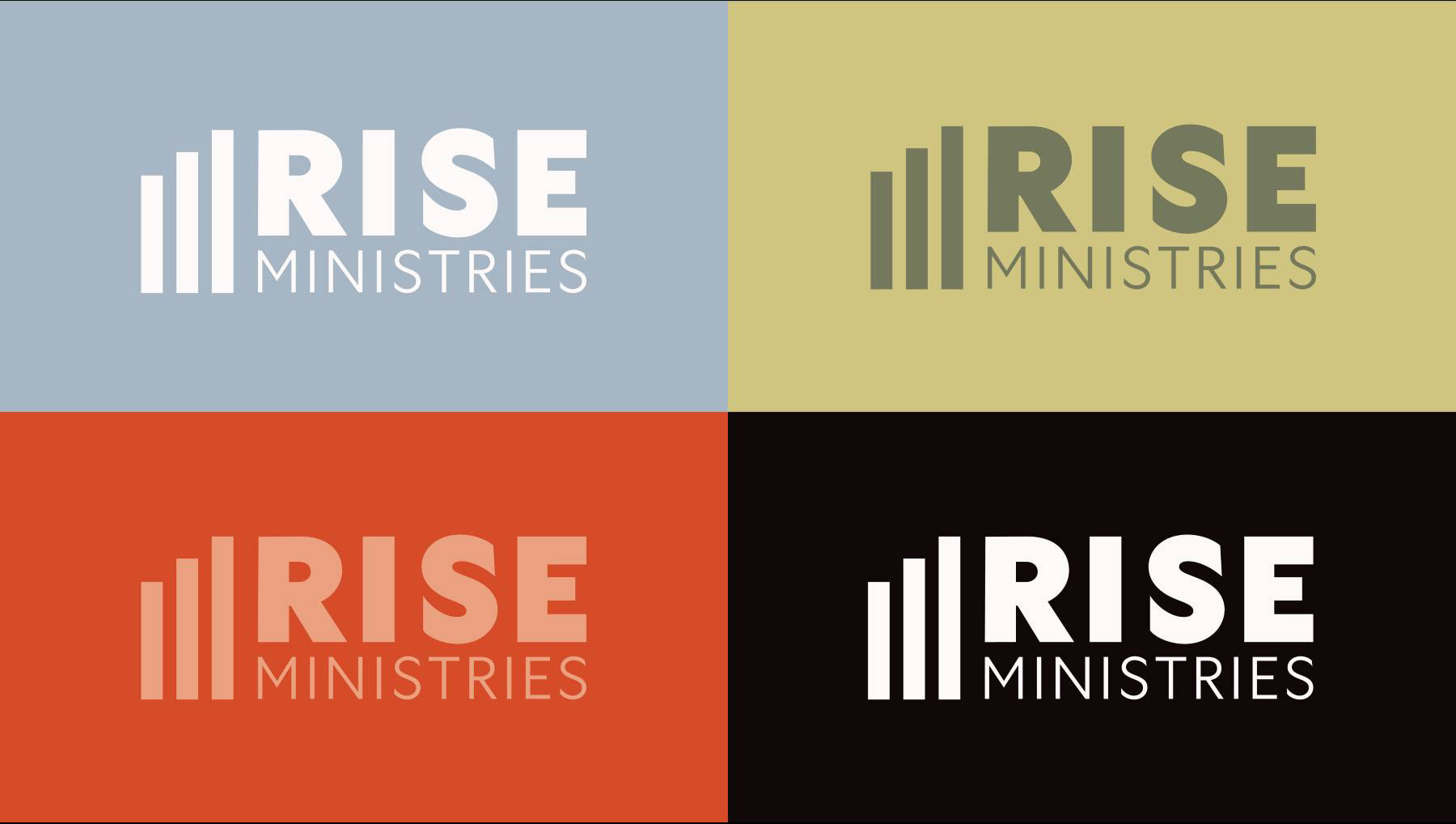
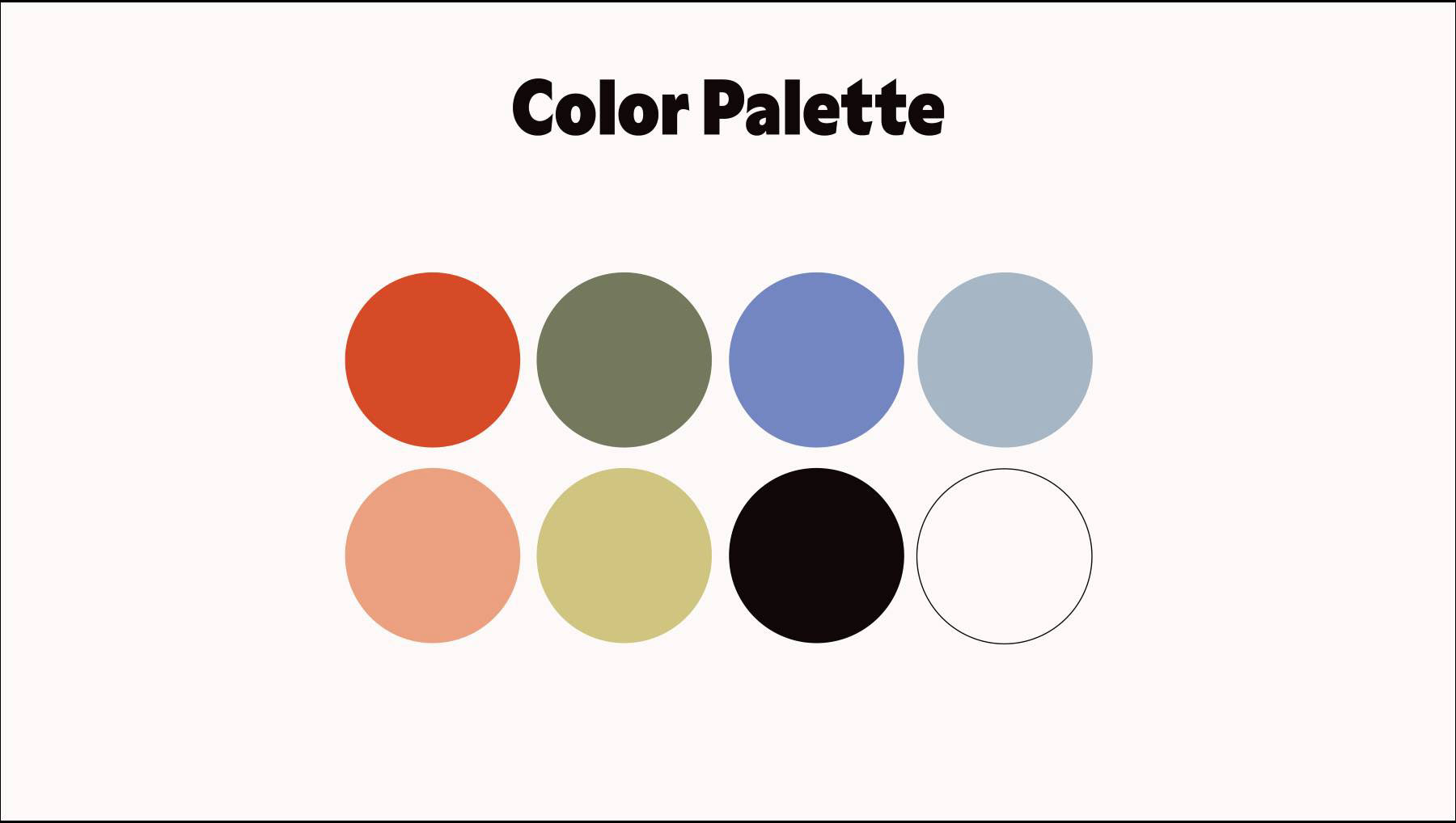
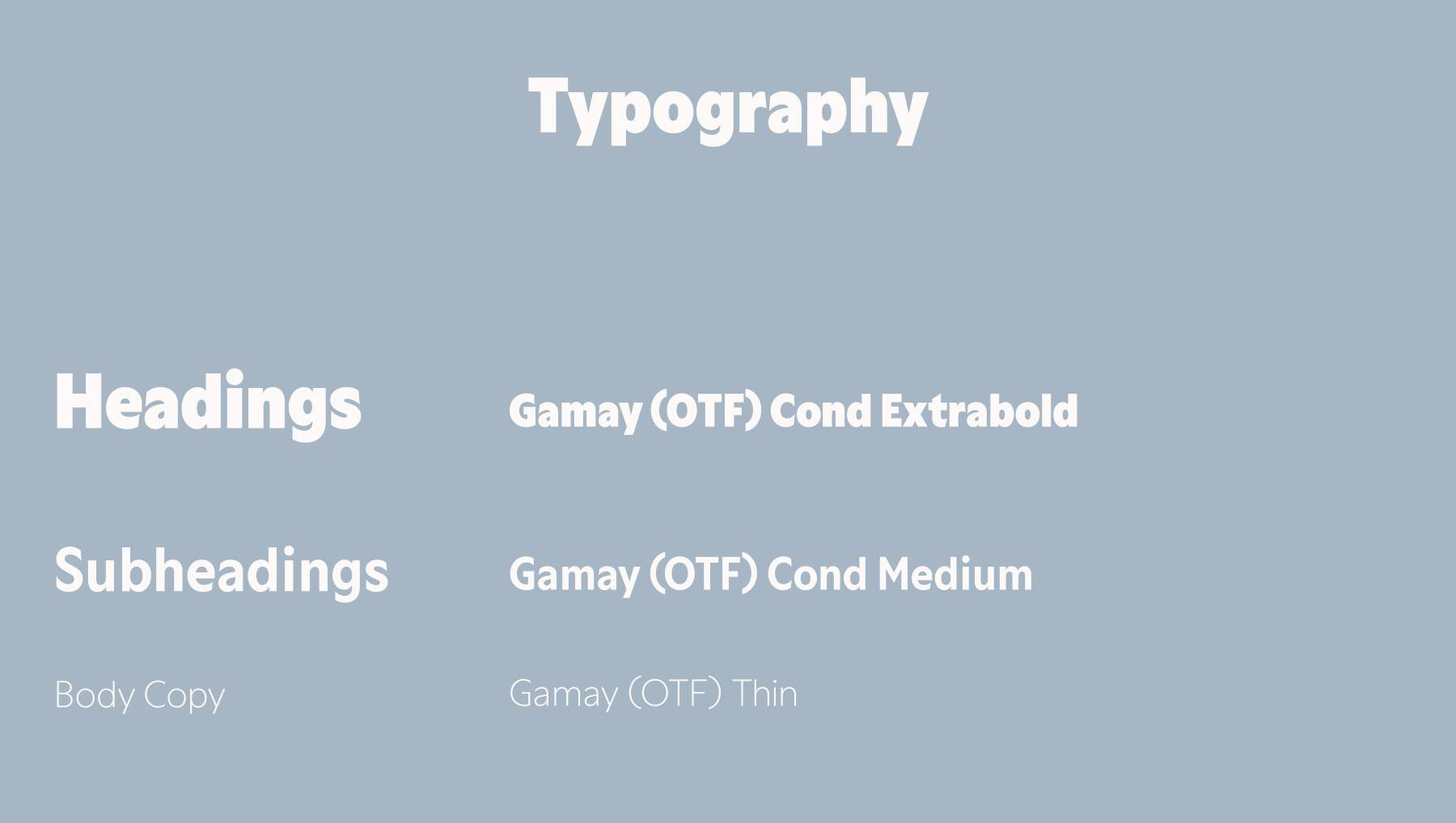
The primary logo was designed to feel modern and upbeat, reflecting the spirit of the name. I chose the Gamay typeface for its clean structure paired with subtle playfulness. The color palette is vibrant and joyful, combining both warm and cool tones to create a sense of energy and balance while appealing to the target audience.
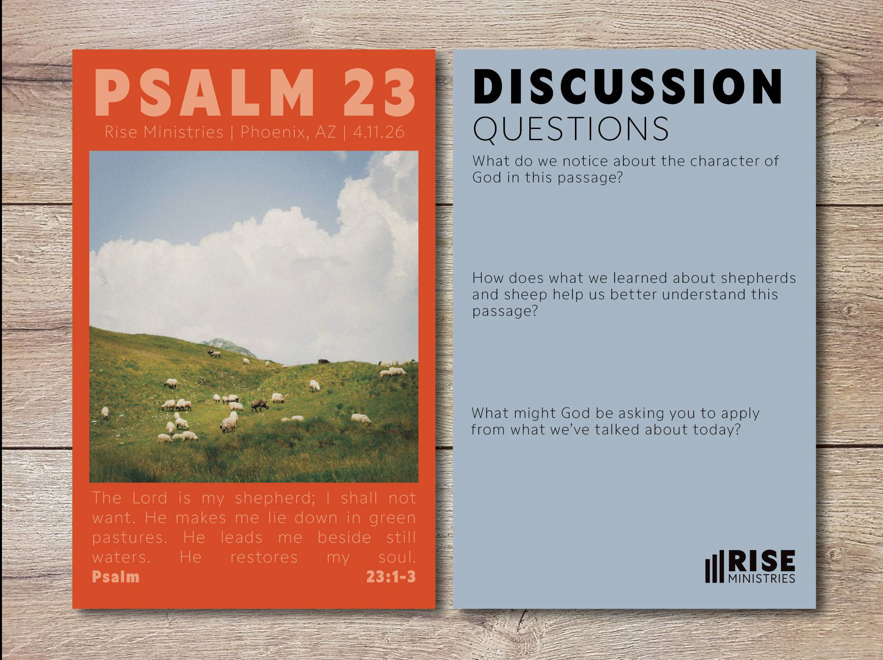
Brand Applications
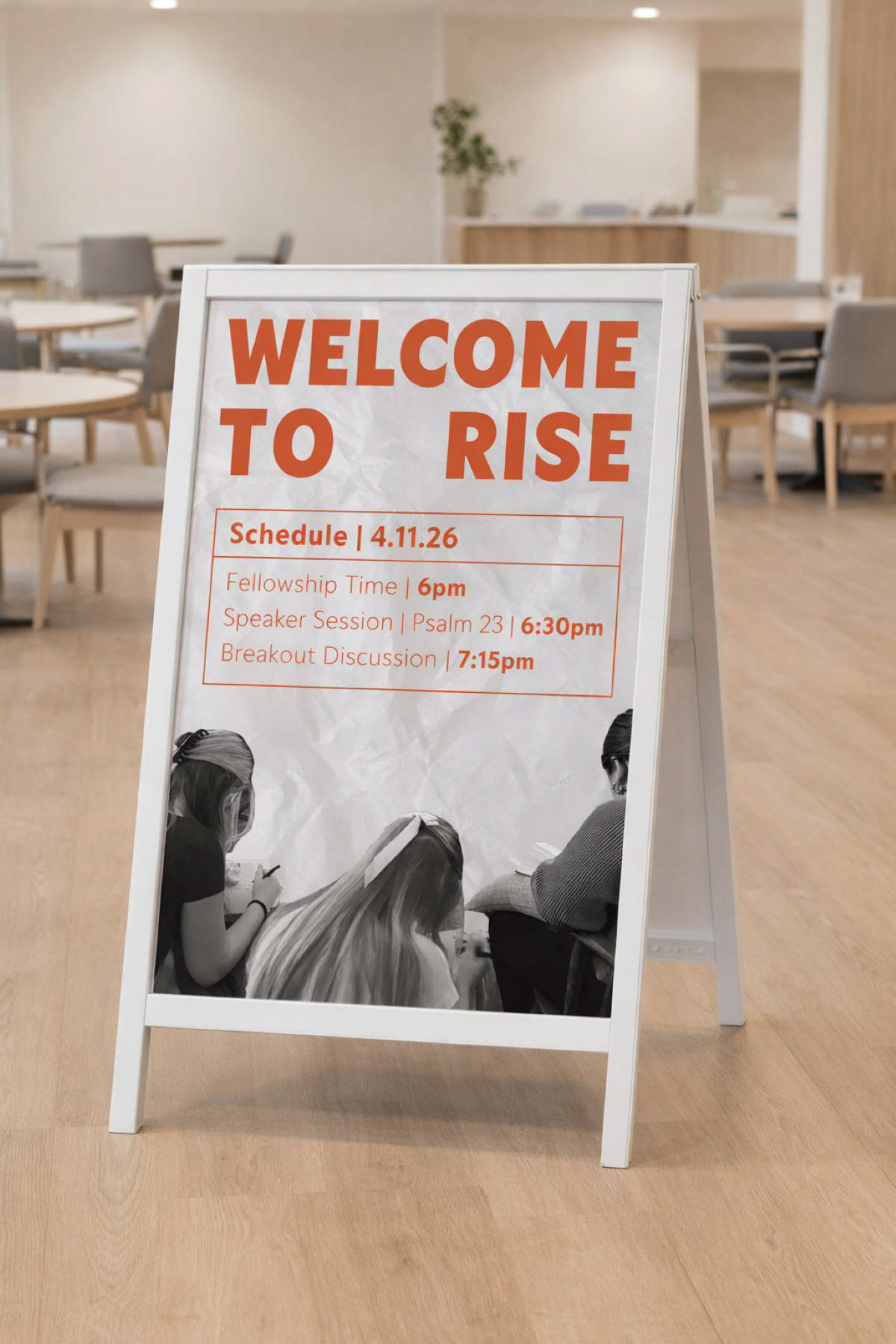
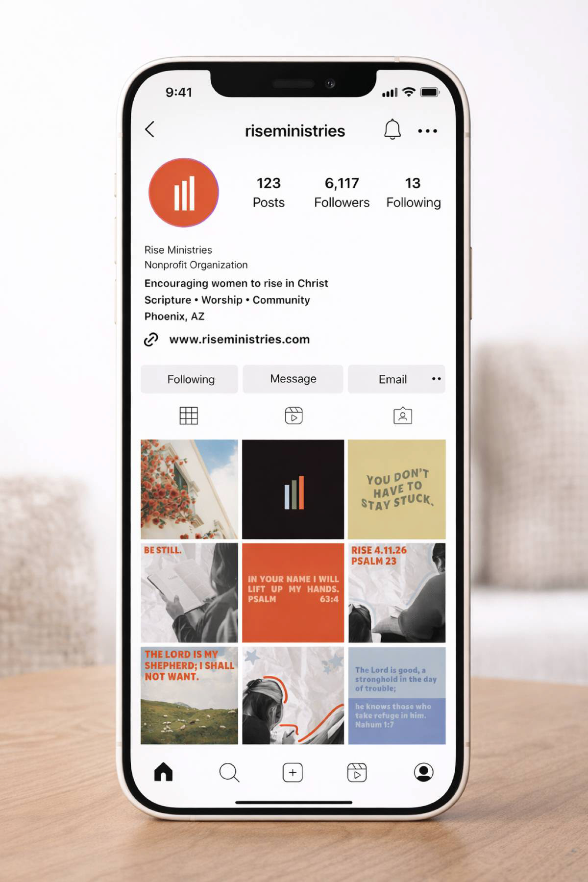
I applied the brand style across event signage, Instagram graphics, and event handouts to give the client a clear sense of how the brand can live in real-world contexts. Throughout these designs, I maintained a playful tone by incorporating a bright color palette and crinkled paper textures. Bold color choices are balanced with black-and-white cutouts to create visual contrast and clarity. Overall, these applications were designed to communicate clearly while remaining visually engaging and encouraging.